Site Redesign
This site first launched in August of 2012, along with the book, .htaccess made easy. In the years since then, the original design served the site well. But since then much has changed on the Web and the site was in growing need of a redesign slash complete overhaul.
Previous Design
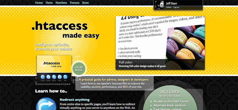
Here is a screenshot of the previous design (the “dot something” theme):
 First design for htaccessbook.com – “dot something” theme version 1 (click for full-size view)
This design was well-received in 2012, even though it was not very responsive. It was colorful, playful, and packed with information. Here are some highlights and bullet points about the original (2012) version of the site:
- Lots of graphics, colors, buttons, and stuff
- Featured an affiliates area and bbPress-powered help forums
- Theme files were many and complicated due to bbPress
- Featured a small, panning slideshow in the header
- Design was not responsive
- Protocol was HTTP (i.e., no SSL)
Additionally, behind the scenes, the file structure had become cluttered and difficult (er, uninspiring) to manage. Long story short, all of these factors sort of culminated into an ultra-focused 7-day site overhaul.
2015 Redesign
Going into the redesign, there were numerous goals, including:
- Make it all responsive
- Make it all streamlined and less cluttered
- Clean up the file structure behind the scenes
- Perpetuate existing branding, recycle key graphics
- Get rid of bbPress and remove all of the affiliate stuff
- Implement SSL/HTTPS
Plus I wanted to add some subtle things like social media meta tags and buttons, complete set of favicons/avatars, and various UI effects. Two weeks later, I am very happy with the results:
 2015 redesign for htaccessbook.com – “dot something” version 2 (click for full-size view)
The new design is fully responsive and features a full-size background slider via “hero” header, inline modal dialogues, slide/fade-in text blocks, icon fonts, Google fonts, social-media meta tags and buttons, and of course, better performance and streamlined everything. Beneath the hood, it’s all squeaky clean and well organized for maximum productivity. I could go on and on, but I’ve got to wrap this project up and repeat the process over at WP-Tao.com.
Some Notes
Some things that are worth pointing out:
- Overall the site is lighter, faster, and better organized after the redesign.
- Technically, SSL/HTTPS was implemented a few months before the redesign.
- The Ninja affiliates program was discontinued several months before the redesign.
- The .htaccess Help Forums are temporarily offline while they are being relocated to their new home at Perishable Press.
- Man it feels SO GOOD to get rid of bbPress. What an unpredictable, inconsistent, convoluted mess. Was able to clean up and streamline a TON of stuff after ditching it. Just sayin’ and just IMHO.
So that’s that. Redesigning htaccessbook.com was a blast. Here’s to the next three years of perpetual change on the Web. Cheers :)